


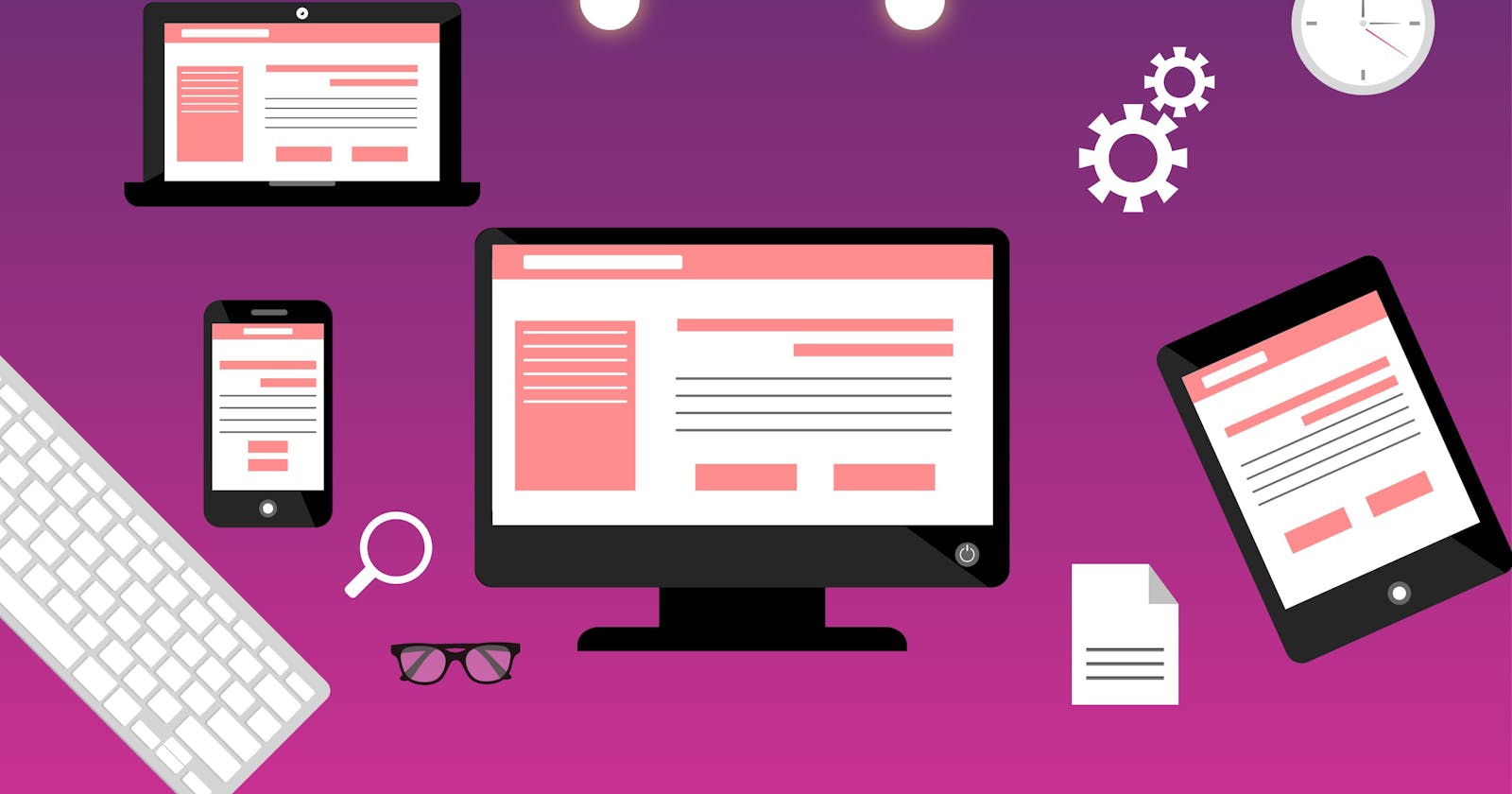
Websites are like a canvas. You have complete freedom to design these as you wish. But unlike a painting, not everyone will be able to see your site the way you want it to. Now you have to adapt your painting to a smaller canvas without losing the beauty of your painting as the canvas is becoming smaller and more compact.
This is where responsive design comes in. It allows you to change the layout based on the devices you are currently using or the screen size. It is one of the most important parts of web development, so learning it properly will benefit you immensely.
Creating websites that look good on all devices is the only goal of a responsive web design.
Viewport
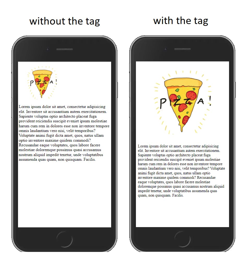
The meta viewport tag instructs the browser to control the dimensions and scale of the page. Without the viewport meta tag, mobile devices render pages at the normal desktop screen width and then shrink the pages, making them difficult to read. Using this tag ensures that the browser will render the page width at the width of its screen width.
<meta name="viewport" content="width-device-width,initial-scale=1" />
Media Queries
Media queries are simple filters that will be applied to CSS styles. Which can change styles based on the type of device serving the content, such as a print or screen, or the characteristics of that device, for example, width, height, screen orientation, hover capability, and whether the device is getting used as a touchscreen. The new styles will be applied depending on the device and whether it matches the media query criteria or not.
@media only screen and (max-width: 600px) {
    body {
        background-color: #888080;
    }
}
Layouts
Since the dimensions and width in pixels of a screen vary widely between devices, content should not rely on a particular viewport width to render well. CSS layout techniques like flexbox and grid layout can help with the webpage unresponsive problem, which is very simple. Flexbox displays items as a single line or wrapped in multiple lines when available space is low. CSS Grid Layout allows the direct creation of flexible grids. Grids can also be used to create a regular grid layout, with as many items as will fit. As the screen size gets smaller, the number of tracks available will decrease.
.items {
    display: flex;
    justify-content: space-between;
}
Relative Units
The CSS unit of the website layout might not be recognizable by the user. However, it's fundamental in creating a responsive website design. Choosing absolute units like pixels is no better than relative units for our purpose. Relative length units don't have fixed sizes, they're relative to something else, which might be the font size of the parent element or the dimensions of the viewport.
div.fullwidth {
    width: 100%;
    padding: 2rem;
}
Just remember
More than ever (54% of total website traffic), people use their phones to browse the web, and so a few changes here or there may change the way people view your webpage.